

Scandinavian Color Palette Guide: Create a Home That Feels Calm, Cozy, and Beautiful
Imagine walking into a home where everything immediately feels peaceful.
The light is soft.
The walls seem to glow naturally.
The furniture doesn’t compete for attention.
Nothing feels overwhelming.
Instead, every color works together to create a quiet sense of comfort.
That feeling isn’t an accident.
It’s the result of a carefully chosen Scandinavian color palette.
One of the biggest misconceptions about Scandinavian interiors is that they’re simply “white rooms.”
They’re not.
The best Nordic homes are filled with warm whites, creamy neutrals, natural wood, soft gray, muted green, earthy beige, and subtle textures inspired by nature.
Together, these colors make even the smallest apartment feel brighter, warmer, and more inviting.
In this Scandinavian Color Palette Guide, you’ll learn exactly how to choose the right shades, combine colors like a designer, and create a timeless home that never goes out of style.
What Is a Scandinavian Color Palette?
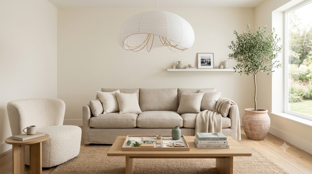
A Scandinavian color palette is built around one simple idea:
Bring the calmness of nature indoors.
Instead of relying on bold colors or busy patterns, Scandinavian interiors use soft, natural shades that reflect daylight and create a sense of openness.
These palettes are inspired by:
- Nordic forests
- Sandy beaches
- Snow-covered landscapes
- Weathered wood
- Stone
- Linen
- Wool
- Clay
- Moss
- Morning light
The result is a home that feels peaceful rather than perfect.
Why Scandinavian Colors Feel So Relaxing
Have you ever wondered why Scandinavian homes seem instantly calming?
It isn’t just the furniture.
It’s color psychology.
Our brains naturally associate earthy, muted tones with safety and nature.
When you surround yourself with soft neutrals instead of loud contrasts, your nervous system doesn’t have to work as hard.
That’s one reason Scandinavian interiors have become so popular in today’s fast-paced world.
Your home becomes a place where your mind can finally slow down.
The 15 Essential Scandinavian Colors
1. Warm White
Warm white forms the foundation of almost every Scandinavian home.
Unlike cool white, it reflects natural light while maintaining warmth.
Best for:
- Walls
- Ceilings
- Large furniture
2. Soft Cream
Cream creates comfort without making a room feel dark.
It pairs beautifully with oak furniture and linen fabrics.
Perfect for:
- Sofas
- Curtains
- Bedding
3. Oatmeal Beige
This subtle neutral introduces depth without overwhelming a room.
It works beautifully in apartments because it adds warmth while maintaining brightness.
4. Light Oak
Although technically a material, natural oak functions as one of the primary colors in Scandinavian interiors.
Its honey-colored grain adds character while keeping spaces light.
5. Mushroom Taupe
Taupe bridges warm beige and soft gray.
It’s ideal for accent chairs, rugs, or textured walls.
6. Stone Gray
Gray should always feel warm.
Avoid blue-gray tones.
Choose soft stone-inspired shades instead.
7. Sage Green
Sage brings nature indoors without dominating the room.
It’s one of the easiest accent colors to use.
Ideal for:
- Throw pillows
- Artwork
- Plants
- Painted furniture
8. Dusty Olive
Olive introduces richness while maintaining a natural appearance.
It pairs especially well with oak wood.
9. Clay Beige
Inspired by Scandinavian pottery, clay beige creates warmth and depth.
10. Sand
Sand connects every neutral color beautifully.
Think of it as the glue that ties a room together.
11. Soft Brown
Chocolate isn’t necessary.
Instead, choose soft walnut or cinnamon-inspired browns.
These work beautifully in leather accents and wooden furniture.
12. Linen
Linen isn’t only a fabric.
Its natural off-white color becomes part of the palette itself.
13. Charcoal
Every palette needs contrast.
Use charcoal sparingly through picture frames, lamps, or small accessories.
14. Forest Green
A deeper green creates sophistication while still feeling connected to nature.
Perfect for one statement piece.
15. Terracotta Accent
Although not traditionally Scandinavian, muted terracotta works wonderfully in modern Nordic homes when used sparingly.
It introduces warmth without overwhelming the neutral palette.
The Perfect Scandinavian Color Formula
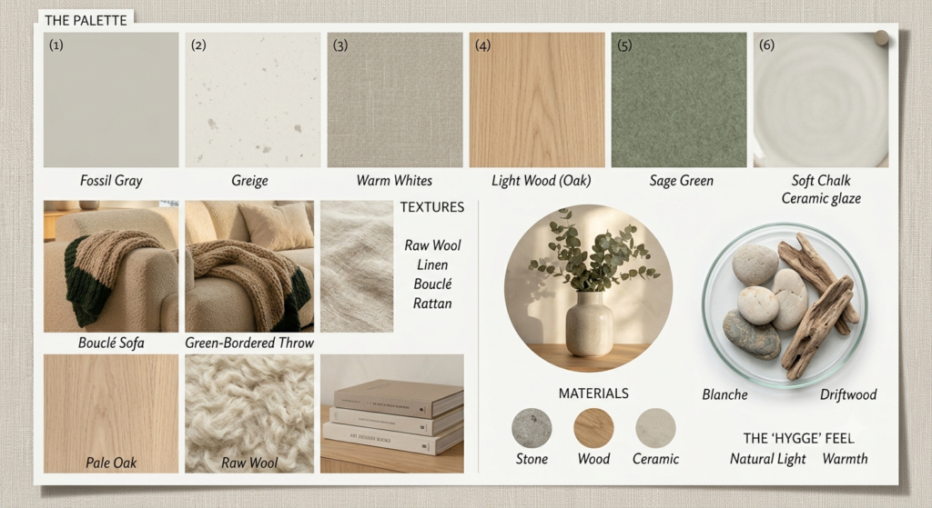
Professional interior designers rarely use equal amounts of every color.
Instead, they create balance using this simple formula:
- 60% Warm White or Cream
- 30% Natural Wood and Beige
- 10% Accent Colors like Sage Green, Olive, Charcoal, or Terracotta
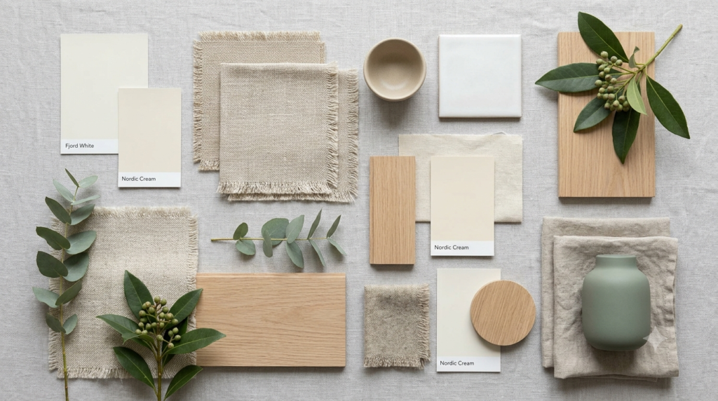
This creates harmony while giving the eye places to rest.
How Natural Light Changes Everything
One of the biggest decorating mistakes is choosing paint without considering light.
North-facing rooms often feel cooler, so warmer whites and creams help counterbalance that effect.
South-facing rooms receive more sunlight, allowing slightly deeper neutrals like oatmeal beige or mushroom taupe to shine without making the space feel heavy.
Always test paint samples at different times of day before making a final decision.
Morning, afternoon, and evening light can transform the appearance of the same color.
Choosing Colors for Small Spaces
Small homes benefit enormously from Scandinavian color palettes because light colors reflect more daylight.
Instead of making every room identical, create subtle variation by changing textures rather than introducing entirely new colors.
For example:
- Cream walls
- Oak furniture
- Beige rug
- Linen curtains
- Sage green cushions
This keeps the home visually connected while preventing it from feeling monotonous.
Color Combinations That Always Work
Here are three foolproof combinations:
Palette One: Classic Nordic
- Warm White
- Light Oak
- Soft Gray
- Cream
Palette Two: Cozy Scandinavian
- Cream
- Oatmeal Beige
- Sage Green
- Natural Wood
Palette Three: Modern Nordic
- Warm White
- Mushroom Taupe
- Charcoal
- Oak
- Linen
Each palette is timeless, versatile, and easy to personalize with artwork, plants, and textiles.